
e-bikeshop.co.uk
Branding — UX & UI Design

e-bikeshop.co.uk is the UK’s original electric bike specialist — and now Europe’s largest dedicated supplier. Stocking premium brands like Orbea, Cube and Haibike, they’ve been a trusted name since 2008. But with a new ecommerce platform on the horizon, the brand needed to evolve. It was time to raise the bar.
We were brought in to modernise their identity, sharpen their voice, and bring a digital-first focus to the next chapter of growth.
Powering Up the Brand
This wasn’t a rebrand for rebrand’s sake. The original identity had gone unchanged since launch — but the market had shifted, and so had the business. We worked closely with the founder to shape a brand that reflects where e-bikeshop.co.uk stands today: confident, established, and ready to lead.
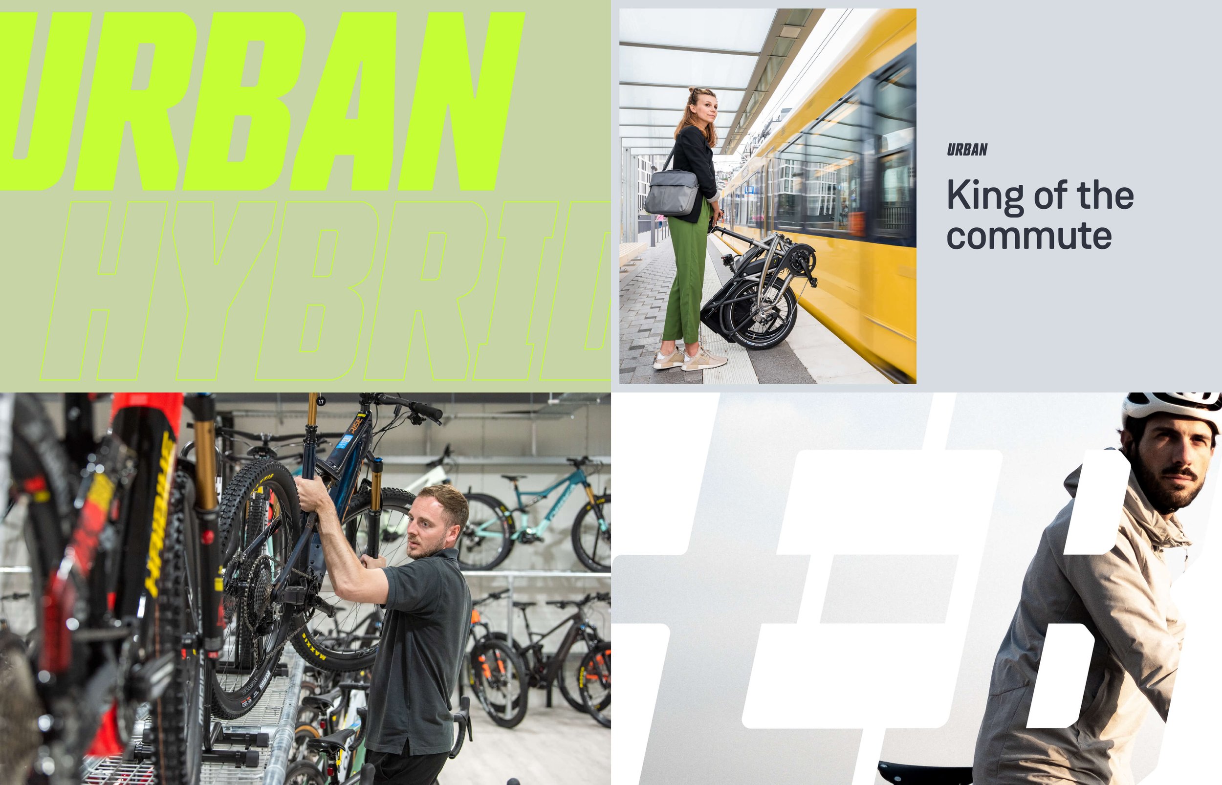
We reimagined the logo with a new brand symbol: a graphic fusion of electricity and cycling, anchored in a stylised bike pedal. Colours were dialled up for digital — bolder blues, brighter accents, and a more versatile typographic system. The overall feel? Professional, but not exclusive. Designed to appeal to everyone from first-time commuters to serious trail riders across the UK and Europe.


A Smarter Storefront
The new brand came to life in a custom ecommerce theme, designed around mobile-first behaviour and user diversity. From casual browsers to expert riders, the experience flexes with the customer.
Product pages were restructured for clarity, with comparison tools, buyer guidance, and clear spec summaries built in. For the confident shopper, the path to purchase is fast and frictionless. For those who need advice, the site offers reassurance without overwhelming detail — making electric bikes feel simple, accessible, and exciting.


